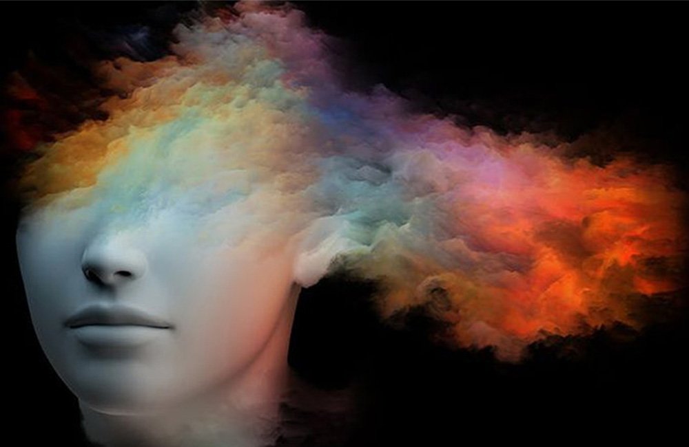
When potential clients visit your therapy website, the first impression is everything. They need to feel welcomed, reassured, and understood, especially since therapy can be a vulnerable experience. One of the most powerful yet often overlooked ways to make your website more inviting and impactful is through the use of colour psychology.
The psychology of colour is the study of how different colors can influence emotions, perceptions, and behaviors. In the world of therapy, choosing the right colors on your website can help build trust, calm anxiety, and encourage visitors to take the next step—booking an appointment.
Here are 4 ways the psychology of colour can improve client engagement on your therapy website:
1. Use Calming Colours to Build Trust
First Impressions Matter
When clients first land on your therapy website, they should immediately feel a sense of calm and trust. Colours like blue and green are scientifically proven to have calming effects, making them ideal for therapy websites. Blue is known for creating a sense of trust and stability, while green promotes relaxation and balance.
What to Do:
- Use soft blue tones in your header, call-to-action buttons, or backgrounds to evoke trust and professionalism.
- Incorporate green accents to enhance feelings of calmness and healing.
- Avoid harsh or bright colours like red or yellow, which can create feelings of urgency or anxiety.
By using calming colours, you create an atmosphere that feels safe and welcoming, encouraging potential clients to stay on your website longer.
Learn how to incorporate calming colours into your therapy website.
2. Use Earthy Tones to Connect with Clients Emotionally
Creating a Sense of Comfort
Clients who visit your therapy website are often looking for emotional support and comfort. Earthy tones like soft browns, creamy neutrals, and warm taupes are comforting and create a grounded, nurturing environment.
What to Do:
- Use earthy colours in your website’s background, service pages, and blog sections.
- Combine neutrals with a pop of soothing blue or green for balance.
- Keep the overall palette soft and gentle, avoiding too many stark contrasts.
Earthy colours can help clients feel more connected to the space, promoting a sense of safety and support.
Discover how earthy tones can enhance your therapy website design.
3. Use Soft Yellow or Beige to Add Warmth
Inviting and Friendly
While colours like blue and green promote calm, adding a hint of warmth can help your website feel more approachable. Soft yellows or beiges evoke feelings of optimism and openness, making your website feel like a welcoming place to seek help.
What to Do:
- Use soft yellow for call-to-action buttons or highlights to draw attention without overwhelming visitors.
- Beige or light tan tones work well for backgrounds or sections to create a warm, inviting atmosphere.
- Keep these colours subtle to avoid creating too much contrast.
By adding warmth to your site, you invite potential clients to engage with your content, ask questions, and ultimately take the next step in seeking therapy.
Find out how to integrate warmth into your therapy website with subtle colour accents.
4. Keep It Simple and Avoid Overwhelming Colours
Less Is More
When designing your therapy website, remember that simplicity is key. Overuse of bright or bold colours can be overwhelming and detract from the calming atmosphere you want to create. Stick to a limited colour palette to maintain a clean, soothing, and professional look.
What to Do:
- Choose a primary colour (e.g., soft blue or green) and use it consistently across your site.
- Use accent colours sparingly for emphasis, such as in buttons or headings.
- Keep your colour palette balanced and avoid clashing or overly bright tones.
A minimalist approach to colour ensures your website remains focused, clean, and easy to navigate, which helps keep potential clients engaged and more likely to take action.
Learn how to simplify your website’s design with a cohesive colour scheme.
Conclusion: Use Colour Psychology to Connect with Clients
The psychology of colour is a powerful tool for any therapy website. By using calming, welcoming, and emotionally resonant colours, you can create an environment that encourages trust, promotes comfort, and engages potential clients. A thoughtful and well-executed colour palette can make a significant impact on how clients perceive your website and, ultimately, their decision to seek your services.
Ready to transform your therapy website with the power of colour psychology? Schedule a free website review with Brandsquare and let’s design a site that truly reflects your practice and attracts the right clients.


