
Why Mobile-Friendly Websites Matter
Most people browse the internet on their smartphones. In fact, mobile internet traffic has surpassed desktop traffic, meaning your website must be optimized for mobile users. If your website isn’t mobile-friendly, you risk frustrating visitors and losing potential clients.
A mobile-friendly website ensures that your content, images, and navigation are displayed correctly on any device. For therapists and wellness professionals, this is especially important—clients who find your site hard to navigate on their phones may not return.
Let’s explore how you can easily make your website mobile-friendly to improve user experience, engagement, and visibility.
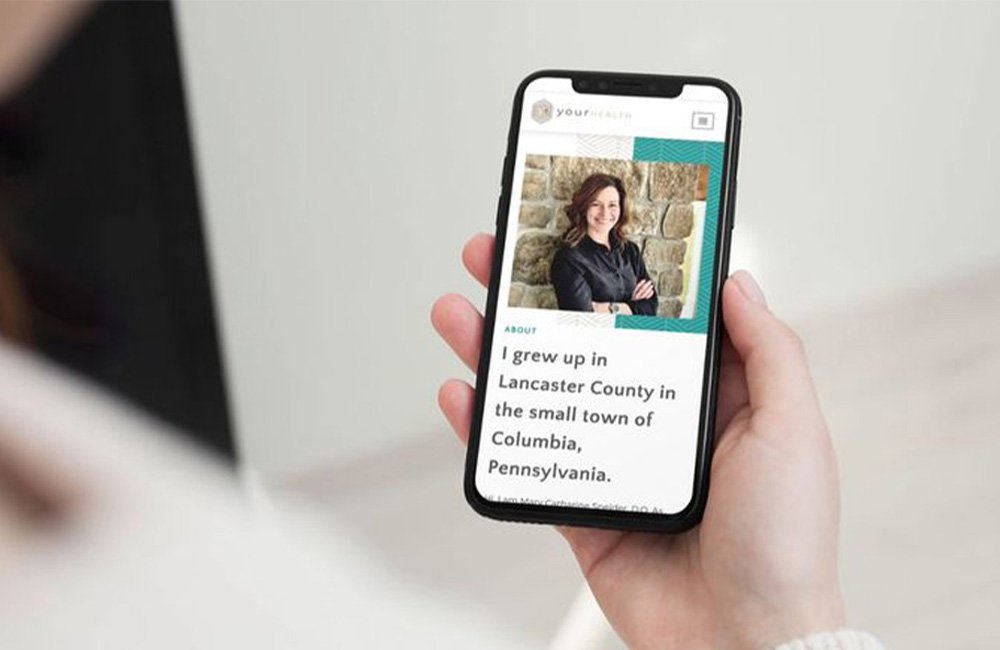
1. Use a Responsive Design
A responsive design means your website adapts to different screen sizes, whether on a smartphone, tablet, or desktop. This ensures that your content looks good and is easy to navigate on any device.
What to do:
- Ensure your website theme or template is responsive. If you’re using a platform like WordPress, look for themes that specifically mention being mobile-friendly.
- Test your website across multiple devices and screen sizes to make sure everything looks well-organized.
Responsive design provides an optimal viewing experience and is crucial for improving your website’s SEO ranking as Google prioritizes mobile-friendly websites.
See how Brandsquare can create a responsive design for your therapy website.
2. Optimize Page Speed for Mobile Devices
Mobile users expect websites to load quickly. If your website takes more than a few seconds to load, visitors may leave before they even see your content.
What to do:
- Compress large images to reduce file sizes without compromising quality.
- Minimize unnecessary plugins and scripts that slow down your site.
- Use a fast hosting provider that offers good speed for mobile users.
A fast-loading website will keep visitors on your site longer, reduce bounce rates, and improve overall user satisfaction.
Learn more about improving page speed for mobile websites.
3. Simplify Navigation for Mobile Users
When designing your website for mobile, make sure your navigation is simple and easy to use. On small screens, complex navigation menus can be difficult to interact with.
What to do:
- Use a hamburger menu (three horizontal lines) for mobile navigation to save space.
- Reduce the number of menu items to only the most essential pages, making it easier for users to find what they need quickly.
- Make clickable elements like buttons and links large enough to tap comfortably without zooming in.
Making your navigation intuitive ensures that clients can easily find the information they need without frustration.
Explore how to simplify navigation for a mobile-friendly experience.
4. Optimize Content for Mobile Viewing
Content that works on desktop might not always translate well to smaller screens. Adjusting your content for mobile viewing ensures it’s both readable and engaging for users.
What to do:
- Break up text into smaller paragraphs so it’s easier to read on a phone screen.
- Use larger font sizes for readability on small screens.
- Ensure that images and videos are mobile-optimized, meaning they should scale properly and not distort on different screen sizes.
Optimizing your content for mobile devices ensures that your visitors will have a positive experience, making them more likely to stay on your site and book your services.
Learn how to optimize your content for mobile engagement.
5. Test Your Website on Multiple Devices
After making adjustments, it’s essential to test your website to ensure it functions properly across various devices and browsers.
What to do:
- Use tools like Google’s Mobile-Friendly Test to check how your website performs on mobile.
- Regularly test your website on different devices (iPhone, Android, tablet) to ensure consistency across platforms.
- Check for broken links, slow-loading pages, or any visual issues that may appear only on mobile devices.
Testing your website ensures that it provides a seamless experience for all users, no matter what device they’re using.
Discover how Brandsquare can help you test and optimize your mobile website.
Conclusion: A Mobile-Friendly Website is a Must for Success
Having a mobile-friendly website is no longer optional—it’s essential for engaging clients and staying competitive. By implementing responsive design, optimizing page speed, simplifying navigation, and testing your site regularly, you’ll create a website that works seamlessly on any device, offering your clients a smooth and professional experience.
Ready to make your therapy website mobile-friendly? Schedule a free website review with Brandsquare and let us help you create a website that works for both you and your clients.


